
For the 100 million homes that currently use a Roku TV or streaming player, things are about to look a lot different.
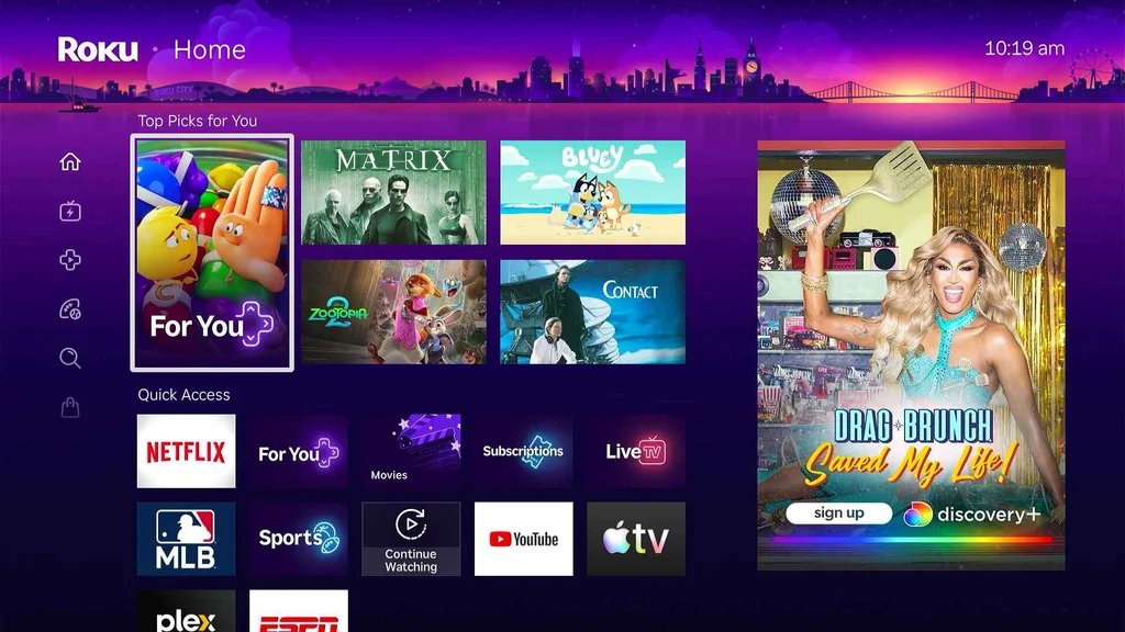
This week, Roku is rolling out a major redesign of its home screen, replacing the grid of static app tiles that has defined the platform for the past 13 years. The new design puts recommendations of movies and TV shows at the top of the screen and adds more direct links to Roku’s other menus, such as its Sports page and Live TV guide. The update will arrive in waves on Roku devices in the U.S., with testing to start in other markets later this year.
“We wanted to craft a home screen that was more helpful, and I hope even occasionally delightful, while staying true to that simplicity that led people to choose Roku in the first place,” says Preston Smalley, Roku’s VP of product.
For a company that tends to avoid drastic changes, this is a big one. But it’s also a key to Roku’s profitability, as it can lean on the new home screen to push more subscriptions and ad-supported TV. At the same time, it’s trying to solve a real problem for users: Navigating through a sea of app tiles can be a pain.
The tension between those two desires—to connect users with what they’re trying to watch, and to upsell them on new things—is one that Roku will have to work even harder to balance now.
Roku’s new look
Roku is pretty much the last streaming platform to embrace a content-centric home screen. Amazon’s Fire TV, Google TV, Apple TV, Samsung TVs, LG TVs, and Vizio TVs have all been promoting content over apps for years.
Still, Roku’s approaching it in a way that feels more Roku-like.
Instead of endless rows of recommendations, the top of Roku’s new home screen has just a cluster. These tiles change over time based on your viewing habits, and you can hit the remote’s star button to approve or disapprove of them individually.
Below that is a “Quick Access” panel that combines app suggestions and links to other parts of Roku’s interface. Users can pin their favorite apps to this panel, but Roku will also use personalized algorithms to mix in other items, like a recently installed app or a shortcut to a frequently viewed genre. While Roku’s full app grid still exists, it’s much further down the page now, past another set of recommendations and links to genre pages.
Smalley says Quick Access is a key distinction from other streaming platforms, retaining some of the app grid’s simplicity while adding a dash of personalization.
“One of the things we found is that not very many people actually customized those app screens,” Smalley says. “They’d end up scrolling all the way to the bottom of this long list. So what we wanted to do was actually pull that all together in a way that made sense for you.”
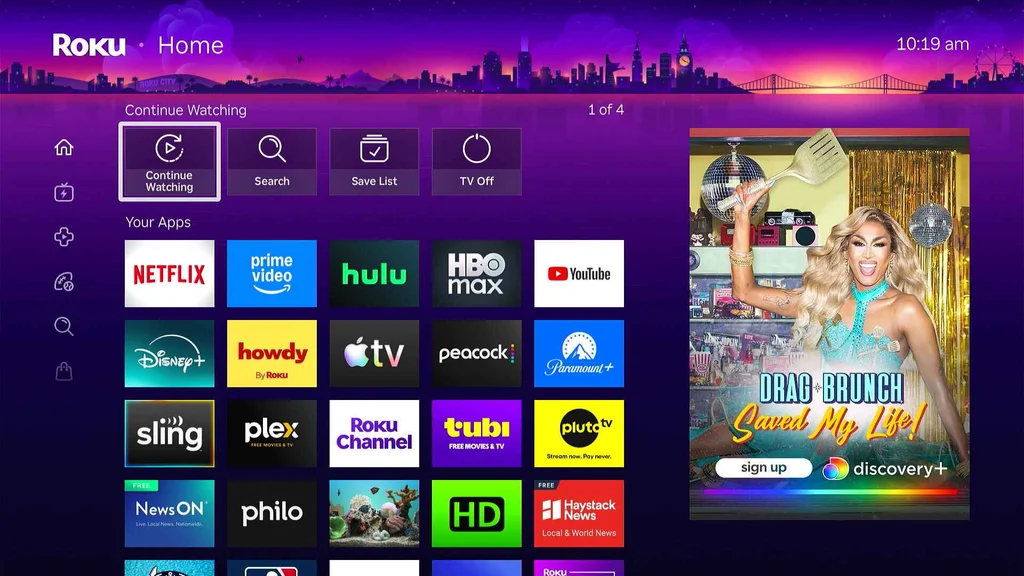
Roku’s also tweaking some of its other menus beyond the main home screen.
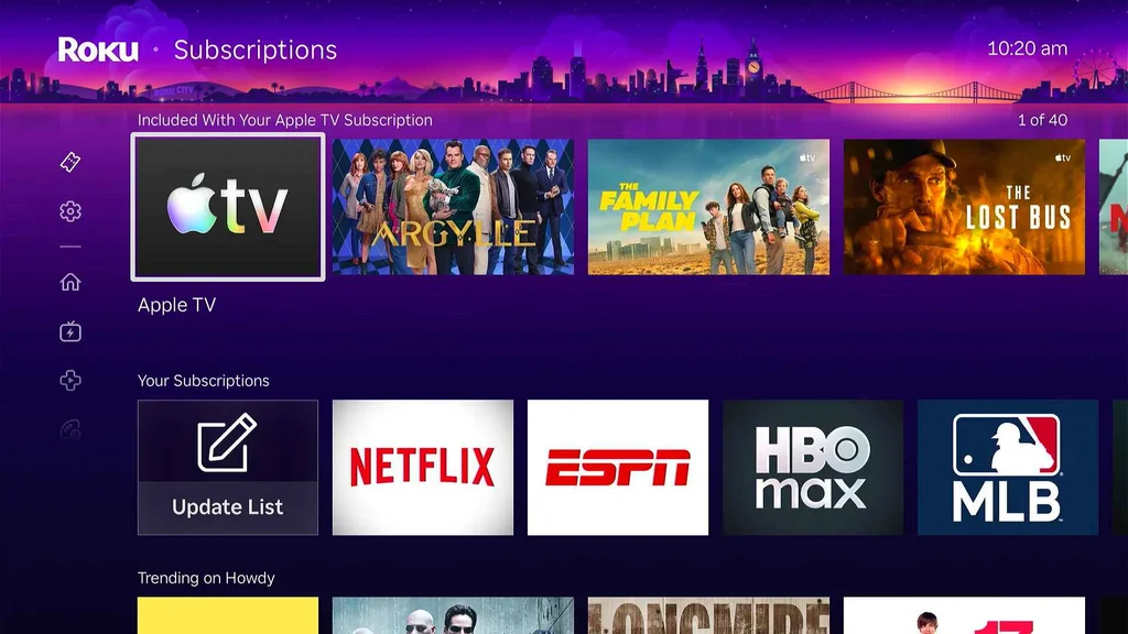
Most notably, a Subscriptions page focuses primarily on movies and shows from the services you’re already paying for. The menu isn’t entirely new, but in the past Roku tried to detect all your subscriptions automatically. Now there’s a way to manually define which services you want to see.
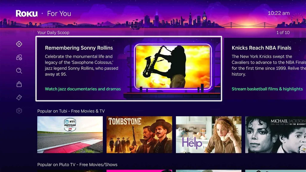
Roku is also more prominently promoting its “For You” menu, previously called “What to Watch.” There you’ll find a “Continue Watching” list of shows in progress, along with “Save List” watchlist items and personalized recommendations. A new “Daily Scoop” row within this menu suggests things to watch based on what’s topical.
Roku has pared down its left sidebar menu as well, removing sections like “Featured Free” and “Daily Trivia.” Smalley says Roku considered scrapping the sidebar entirely, but that idea didn’t test well. It settled on hiding the menu when users click the remote’s Home button, but adding a new set of icons so users know they can click over.
Overall, the new home screen feels more thoughtful and less chaotic than the likes of Google TV and Fire TV, though not having a “Continue Watching” row directly in the main menu is a puzzling omission. Either way, it’s likely to polarize some folks who view the app grid as a creature comfort.
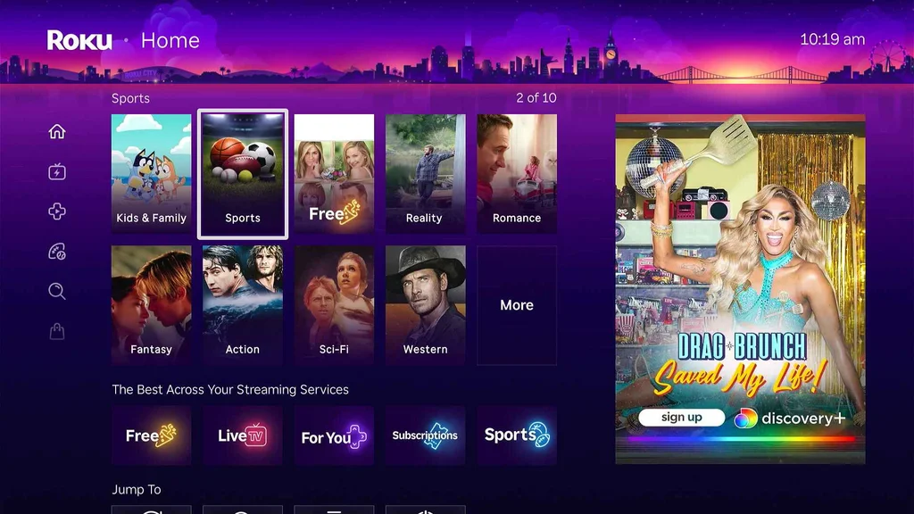
To that end, Roku is offering an escape hatch: By digging into the “Home Screen” section of the Settings menu, you can disable the new recommendation rows and Quick Access panel while also making app tiles larger. This effectively restores the Roku home screen to what it was before.
“We found that not very many people opt to go that route, and they’d rather us handle it,” Smalley says. “But we do understand for some purists, they’ve put in the time to make that exactly the way they want, and so there are ways for them to do that even in this design.”
Long time coming
A new home screen may not seem like a huge deal, but it’s a big part of Roku’s plan to finally turn a steady profit in streaming, 18 years after launching its first set-top box. Last year was the first time Roku achieved positive net income, earning $88 million on $4.74 billion in revenue.
While CEO Anthony Wood once described Roku as being in the advertising business, lately it’s become more focused on growing subscription revenue, taking a cut of sign-ups that flow through its platform. Refashioning the home screen around content recommendations helps Roku push more of those subscriptions.
“We’re driving more engagement and viewer satisfaction,” Wood said of the new home screen in a February earnings call, when it was still in testing. “We believe it will increase monetization over time, whether that’s getting viewers to sign up for subscriptions or watch more ad-supported content.”
Still, Roku has to avoid leaning too hard into monetization, lest it cause users to tune out.
Smalley notes that none of the new home screen tiles are sponsored. While Roku still has display ads on the right side of the home screen and at the bottom of the left sidebar, streaming companies can’t buy their way into the new recommendation tiles. And even if those tiles help sell more subscriptions, Smalley says the main goal is for them to connect users with what they want to watch.
“One of the things we want is that the home screen helps provide the opportunity for you to get value out of the things you already have,” Smalley says. “So we’re going to heavily weight the recommendations to those types of content.”
It’s unclear exactly when all Roku users will have access to the new home screen, but Smalley says the rollout will be “fairly near term” for users in the United States. While early testers have been given the option to revert to the old home screen, that option is going away as Roku feels confident in what it’s delivering.
“We really wanted to make sure,” he says, “that this works not just for most of our viewers, but for all of the 100 million households that choose to stream with us.”
